sarah-wach.github.io
Design Transformation Challenge
Transform one of the existing screens from the large prototype according to Google’s design guidelines.
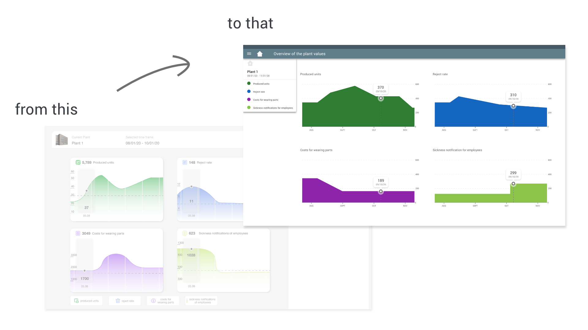
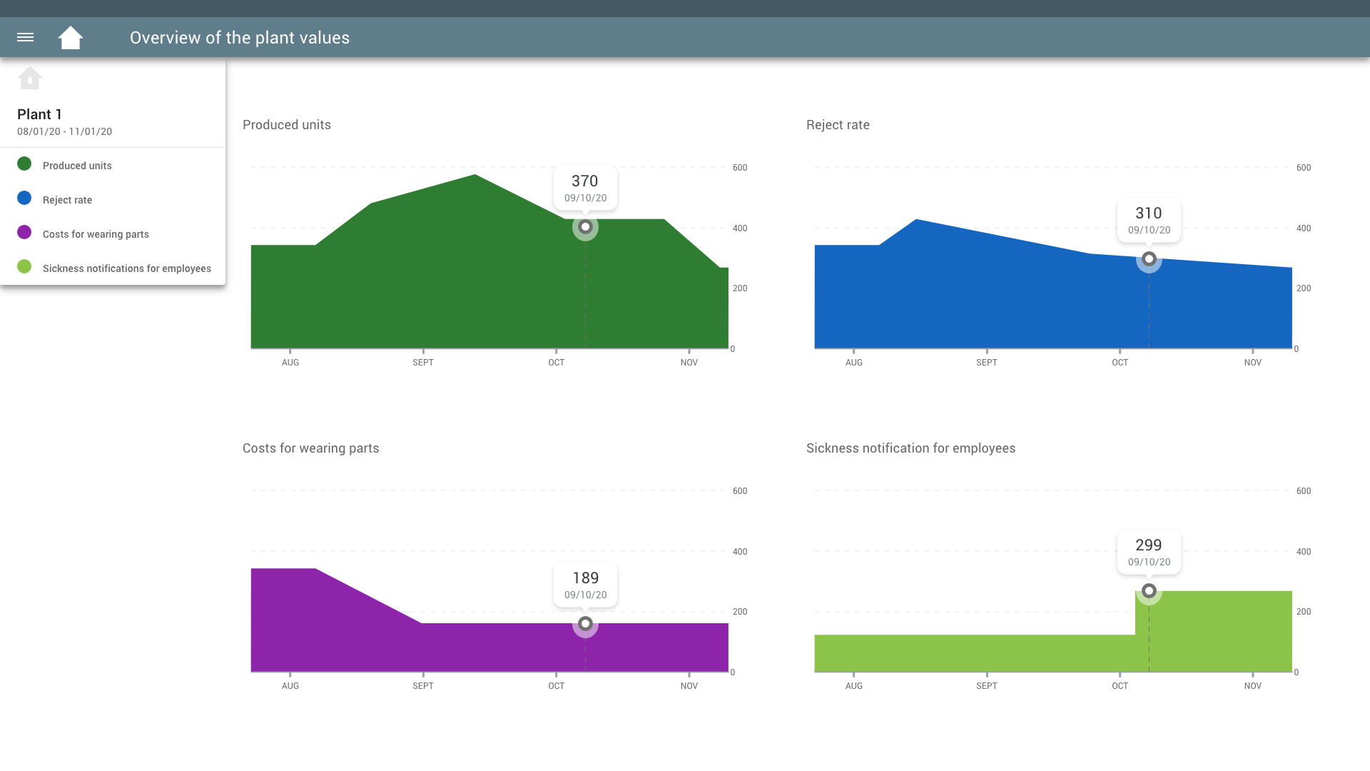
For this task, I chose the large screen with four selected diagrams and the fold-out menu on the side. I made sure that everything is very consistent and aligned on a grid.
The first step was to look through all the rules of google material design. For the implementation, I started to build a grid for the big application. The grid at google material design for screens larger than 1920 px is based on 12 columns and 24 px wide margins and gutters. Icons, maps, areas, and fonts are based on this. There are some rules based on the real world, for example, seen on the top app bar or the side menus shadows. Material specifies many components for the UI design. For example, there is the top app bar it displays information and actions relating to the current screen. It appears at the top of each screen and provides a reliable way to guide users through an app. In the case of my example, the top app bar contains a navigation icon (menu) on the left side and an icon and title, so the user knows where he is. The colors of the top app bar are dark gray. The bigger part at the bottom is a little bit lighter than the upper part. Dark grey is a restrained color, which stands out from the rest of the screen and is therefore always clearly visible.
For the menu on the side I used a navigation drawer, it provides access to destinations in the app. It is identifiable as a navigation menu because of the placement and list-style content. It is also organized and the content is contextual to the content on the screen. The colorful circles before each bulletpoint in the menu belong to the color-matched diagramms on the screen.
Each of the diagrams has a data label that appears when the mouse hovers over it. The diagrams have their color, which reflects each value accordingly.
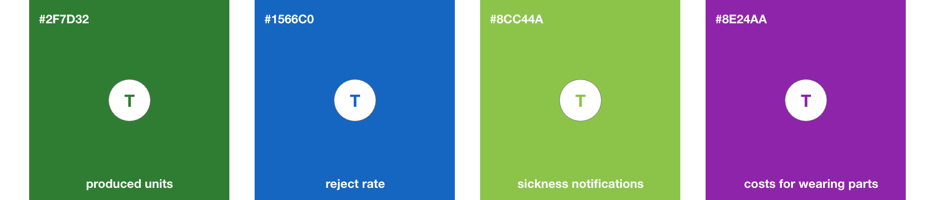
All colors are based on the material color system. The meaning of the colors are the same, I just adjusted the right shade of material.
The final Screen: