sarah-wach.github.io
Initial GUI Prototyping
Mid-fid/High-fid Prototype
the next step is to bring your concept on a higher visual and interactive level (on content level it’s going to be placeholder data of course). You can use any GUI prototyping tool (I recomment Axure, proto.io, figma or Adobe xd, but go ahead and make your own experience). Your final prototype is a browser-based, interactive application (means, no EXE for instance), depending on your tool you need to export/deploy.
Click here to view the xd prototype
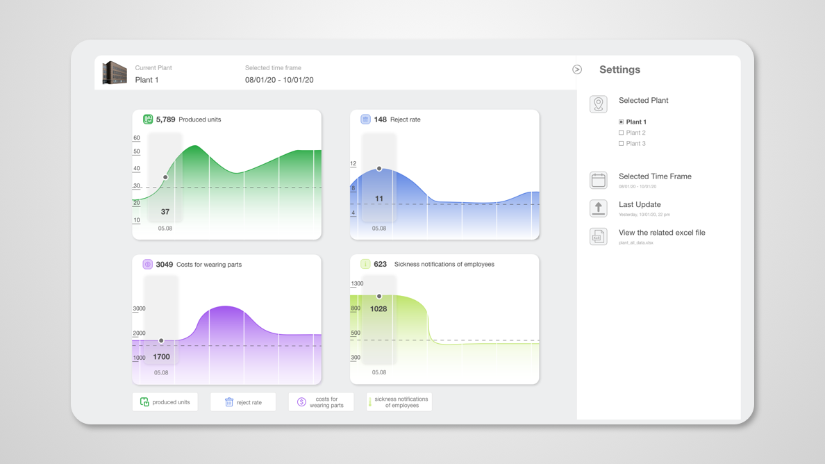
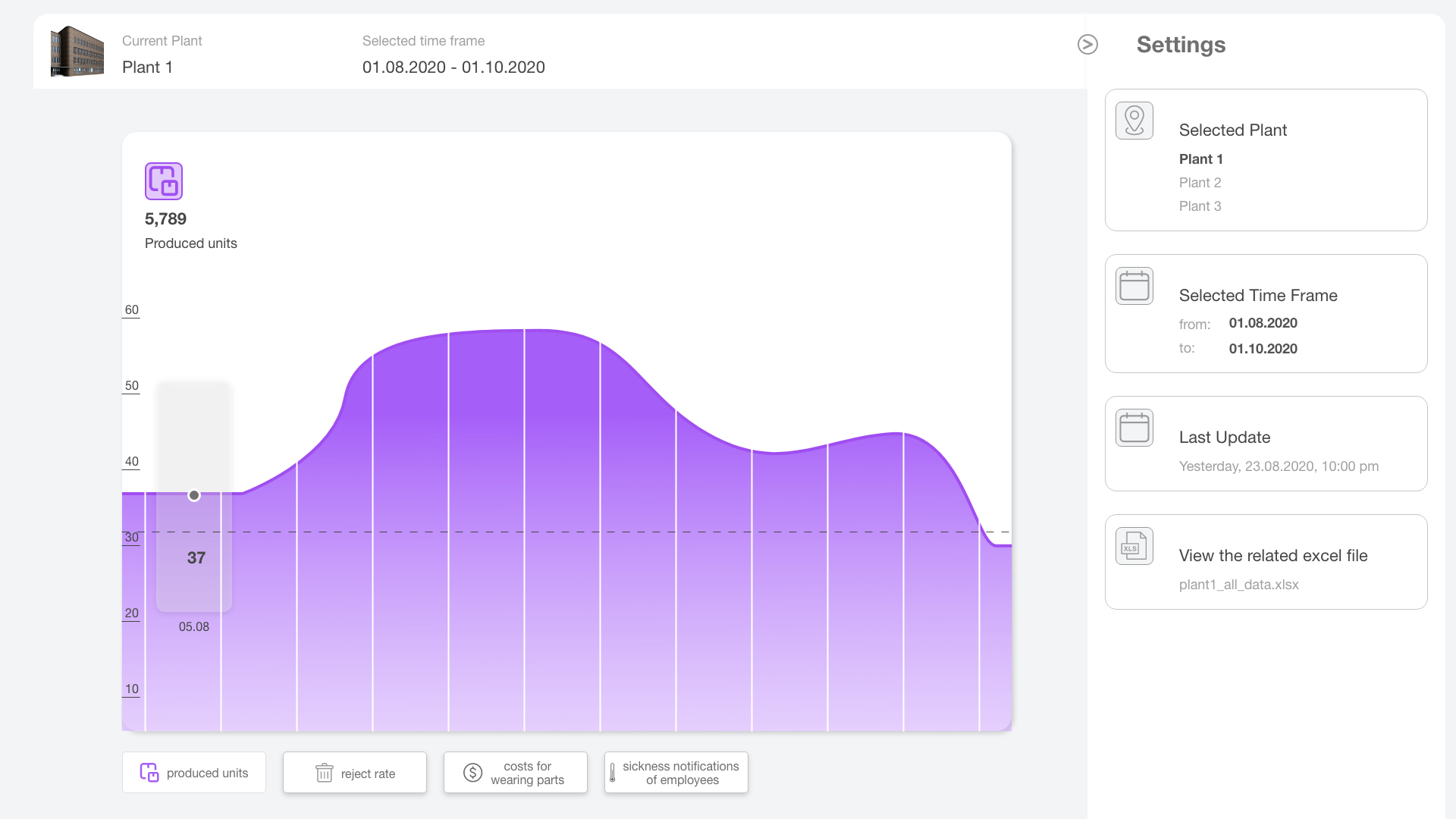
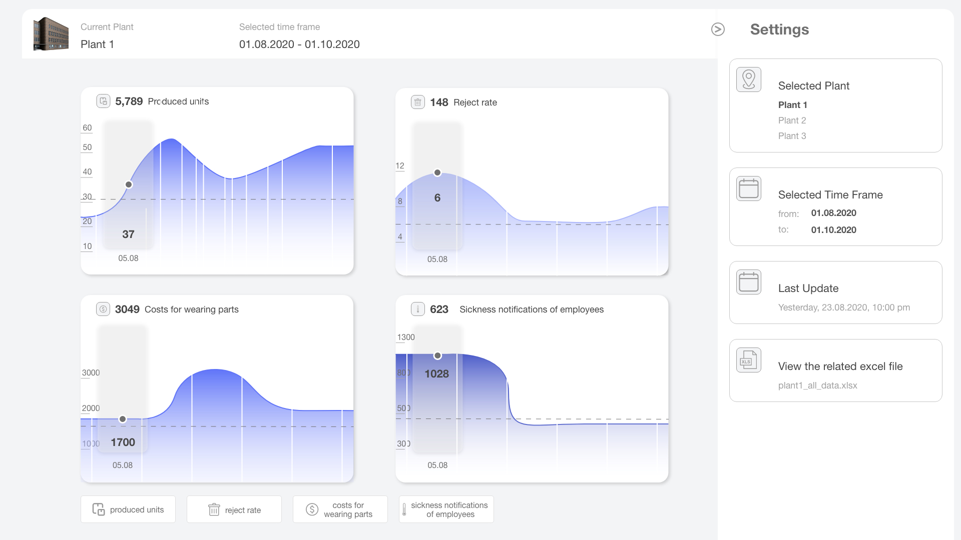
The next step is to bring the concept to a higher visual and interactive level. To complete this task, I used Adobe xd for the first time. Normally I use Sketch, but this time I wanted to use a different program because I was interested in the prototype function of xd. I started with the screen, on which a full-screen graphic can be seen. In the settings, you can change the plants and the time frame to be displayed. The last update and the complete Excel file can be viewed here. In the top row, the selected plants and the selected time frame are displayed. The buttons below can be used to select the information displayed in the graph.
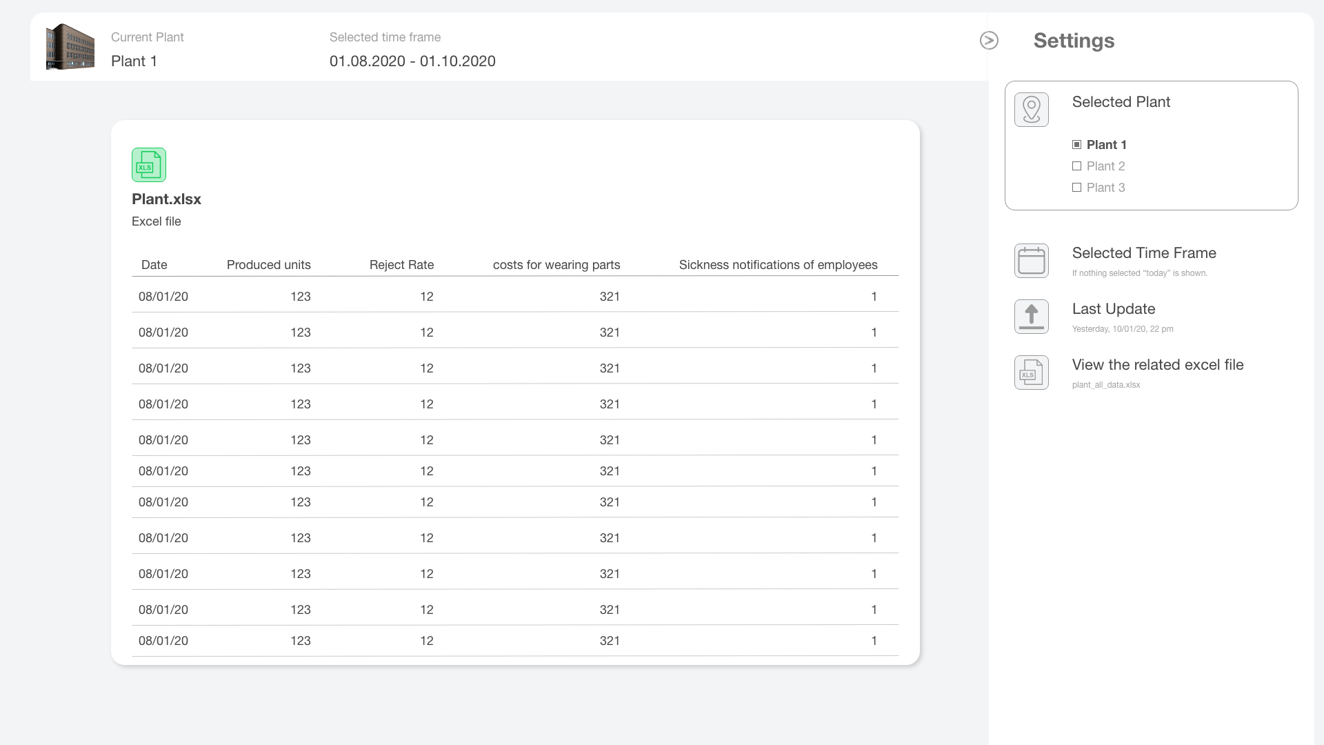
Next, I implemented the Excel file. I made sure that it was easy to read, for example by aligning all numbers on the right side. In this way, large numbers can be identified more clearly, because you can see immediately if a value is larger or smaller.
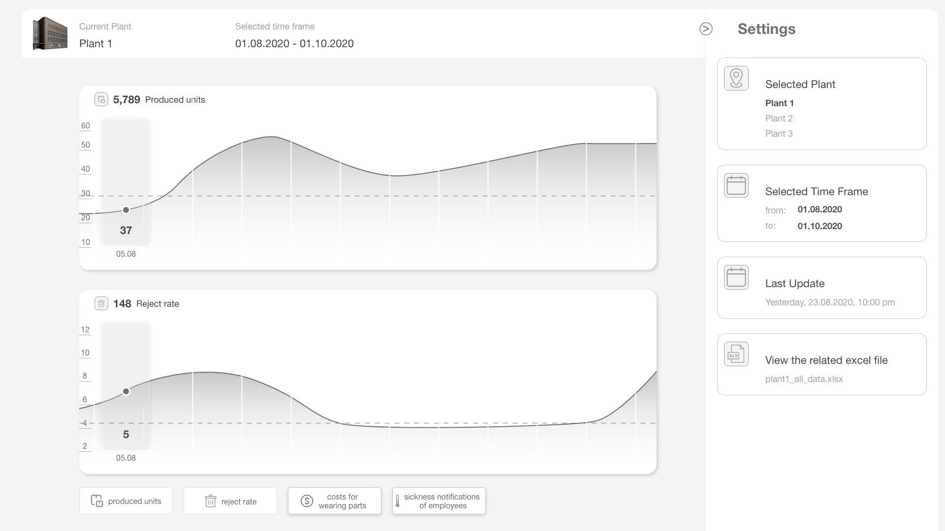
To be able to put several graphics together on one page, they had to be scaled down. There are three possible sizes, one full-size, one with half the height, and a small one.
To get a better differentiation, I added some color. At first only blue, but this made it harder to separate the different categories. After that, each of the four categories got its color. I have chosen light, neutral colors, which are used for most of the surface. White and grey are good for creating a neutral, professional environment. Where there is a lot of white, the eye can come to rest.
When multiple works are selected, the display changes from a filled line chart to a simple line chart. This is because the readability would decrease with the filled-lines. For the final prototype, I reworked the color once more. The blue tones here stand for calm, calmness and are often used for trustworthy institutions. Blue is directly associated with trust and professionalism and is therefore well suited for data visualization. Violet is both warm and cold and combines attributes of red (often negative or dangerous) with blue (calm and calmness). This ensures good color differentiation. Green is associated with growth and in the USA also with money and success. Green also brings a sense of visual balance and as a result a calming and relaxing influence. Yellow-green may indicate illness, cowardice, discord and jealousy.